Photo by Alexander Andrews on Unsplash
marketing + Brand Identity
How To Choose
The Right Typeface For Your Brand
October 15, 2018 • 7 min read
Typography done well is incredibly powerful. You should have some knowledge of typefaces and typography when discussing options with your designer. The typefaces you choose will convey both message and feeling to your viewer, so it is important to choose wisely.
“Words have meaning. Type has spirit .
The combination is spectacular.”
There is a lot to think about, but don’t get intimidated. Read on for some basics about type, what to look for when selecting and combining type families, and where different types work best.
The Four Basic Kinds of Typefaces
- San Serifs do not have any embellishment on the ends of letterforms
- Serifs are named for the little feet at the end of the strokes in a letterform
- Slab Serifs have thick, blocky serifs
- Script typefaces mimic cursive handwriting and can be formal or casual
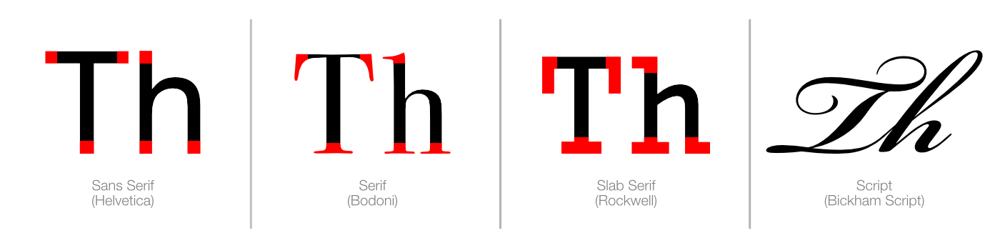
You can see if the font is serif or sans serif by looking at the ends of strokes, indicated by the red in the letters above.
It’s Important To Select Typefaces That Reflect Your Brand
When working on a logo design, choosing a typeface that reflects the company, product, or service seems obvious. Yet many businesses put little or no thought into the typefaces used throughout their written communications. Instead, they just use one of the system fonts from their computer. It is hard to project a unique brand when you are using a font that everyone has.
It’s worth putting some thought into the typefaces you use because they go a long way in supporting your brand identity.
Every typeface has its own personality and style. Some of this comes from the time period the face was created in. Some of it is intended by the designer and comes from the physical design of the letters. And some of it comes from the associations we have built from the way the typeface has been used over time.
A Quick Guide To The Personality Of Typefaces
- Sans Serifs with their clean economical lines can be seen in a variety of ways. Thin san-serifs like Gotham Thin or Helvetica Neue Thin project a sense of modernism and style. Bold sans-serifs, like Montserrat Bold and Helvetica Bold, are also modern but tend to be seen as more casual or strong.
- Serifs tend to be seen as traditional and reliable. Serif typefaces are considered easier to read than sans-serif because the serifs make each letter distinct and help our eyes track horizontally while reading. Because of this, they are great for body copy and long-form writing. Examples of popular Serif typefaces are Bodoni, Times New Roman, and Libertine.
- Slab Serifs bring to mind strength, confidence, and style. Clarendon and Egyptienne are good examples of Slab Serif faces.
- Script typeface’s curves, loops, and twist give the typeface a romantic, elegant, and sophisticated look. Good examples are Bickham Script or Lavanderia.
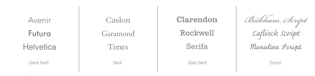
A few examples of some common typefaces.
A word on choosing a logo typeface. A logotype should never be typed out and used “as is.” When you work with a professional designer, they may begin with an existing font, but they will likely redraw the letterforms, adding or taking away to create a distinctive look. The point is that your logo is a unique representation of your company. It should not be easy to copy.
Do You Need More Than One Typeface For All Of Your Written Communications?
After you choose a logo typeface that reflects the mood and personality of your brand you’ll want to select two more typefaces to be used whenever possible in your written communications. Purchase the appropriate licenses so you can install the fonts on all of your company computers and have them used in the layout of your website and advertising materials.
You should have one typeface for titles, headings, and web components like buttons and navigation. The second typeface will be used for all body copy and long-format writing.
The typeface you choose for titles and headings should look good in relation to your logo font. It should carry on the theme and reinforce your brand personality.
The typeface you choose for body copy should pair well with your heading typeface, but most importantly it has to be easy to read.
“She feels in italics and thinks in CAPITALS.”
How To Create Font Pairs That Work Together
Everything from magazine spreads to websites benefit from well-chosen font pairings. When it comes to pairing fonts the options are endless. And while there
Three Easy Font Combinations
Sans-Serif Headline with Serif Body Text
This common font pairing is popular because it just works. A modern sans-serif paired with an easy to read serif make a pairing that is both functional and stylish.
Sans Serif Headline
With Serif Body Copy
Open Sans, a clean modern san serif
pairs nicely with Lora, a well-balanced
contemporary serif. Serif body copy
helps make dense information and
long-form writing easier to read.
Headline: 24 point Open Sans
Body: 16 point Lora
Serif Headline with Sans-Serif Body Text
This font pairing gained popularity on websites where it
Serif Headline With
San-Serif Body Copy
Libre Baskerville is optimized for
body copy, but it works well as a
headline with Roboto for body copy.
Roboto’s friendly, open curves provide
a natural reading rhythm that works
well for long blocks of copy .
Headline: 24 point Libre Baskerville
Body: 16 point Roboto Light
Headline and Body Text from the Same Font Family
Feeling a bit overwhelmed or confused yet? That’s okay. Here is a sure-fire way to create a cohesive and elegant pairing. Going this route is easy. You need to make sure you select a family with plenty of variation (e.g. bold, italic, thin, etc.)
Headline And Body
From The Same Family
Choosing a font with lots of styles,
like Montserrat allows you to use size,
weight, and style to create plenty of
variation and a hierarchy to make
things easy to read
Headline: 24 point Montserrat
Body: 16 point Montserrat
Some font families can be limited while others might include dozens of styles. These “superfamilies” can even offer up serif and sans-serif versions that work well together because of their shared similarities.
Google Font Pairing Suggestions
Want some more examples of good font pairs? Check out Google Fonts. Once there you can filter by category, popularity, and style.
Once you’ve selected a typeface you are happy with you can see the fonts character set, learn some of its history and personality, and finally see some popular pairings for that font.
Pro Tip: If you want to be unique, don’t go for the trending or most popular choices.
You’ll be given several other fonts that work well with your chosen font and be able to compare them set as the title or the body copy.
With the goal of “Making the web more beautiful, fast, and open through great typography,” Google Fonts offers more than 850 free font families. All fonts are released under open source licenses.
Choosing The Right Fonts Helps Reinforce Your Brand
That’s a quick overview of how to look at typefaces to ensure they support your brand identity. Having read this article you should be ready to confidently discuss your options with your designer or even choose some typefaces for yourself. ?

0 Comments