
Graphic Design + Typography
Master Typography To Make
Your Documents More Engaging
December 15, 2018 • 10 min read
Every document from résumés to business cards and brochures to websites benefits from good typography. Improved legibility means your documents communicate better, and because they are pleasing to the eye they create good first impressions before the first word is even read.
Don’t Trust Your Software’s Settings
Most software has default settings for typeface, type size, line spacing, margin size, and text alignment. Most, if not all, of your documents, will benefit if you change these settings.
Your aim is to match the tone of your typefaces to the intended tone of your content—do that and your message will be more memorable and powerful.
You can guide your reader through the document by providing clues as to where they should focus their attention by creating a visual hierarchy with multiple type sizes.
Consistency Is Key
Typographic elements such as titles, headings, body text, and captions should each have their own unique style. This helps create a hierarchy, guides the reader through the document, and helps to set the reading pace. Choose an appropriate font, size, and treatment for each of these elements and maintain the visual style throughout your documents.
Pro Tip: Maintaining a visual style across all of your businesses documents (in print and online) helps to enforce your brand identity and improve your market visibility.
Poor visual design creates confusion for the reader and distracts from your message. Visual consistency allows readers to focus on the content, making your message more effective.
Before you begin, decide what typefaces you will use. Determine what type sizes will be used for each element: titles, headings, body copy, etc. And know what amount of leading, the space between lines, and tracking, the space between letters, each element should use.
Learn To Use Typography Styles
Most software has the ability to assign styles to the various elements of your document. Using styles helps enforce consistency and can save time if you need to change an element’s format since making the change to the style will update the entire document.
The visual hierarchy should directly relate to your document’s outline. Each level in the outline should have its own type style that clearly shows how each level relates to the level above or below it in the outline. A strong visual hierarchy directs the flow of the document and helps to set the pace for the reader.
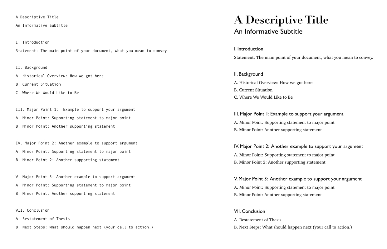
A basic outline (left) and with a visual hierarchy established with styles (right.)
You can establish a hierarchy in a number of ways: typeface, type size, type weight, italics, white space, and leading are the most common.
The hierarchy is enhanced by grouping related page elements together (heading/subheading, subheading/paragraph, image/caption, etc.)
If your titles, subheadings, and body copy all have the same distance between them it is difficult to know what goes together and can disrupt the flow of your document. By placing related items closer together and unrelated items farther apart you create groups. These groups provide visual clues that make your document easier to read and more effective.
Black, White and Reverse Type
Good contrast between text and background ensures your content is clear and easy to read. Black and white documents provide the highest level of contrast. Low contrast layouts can lead to eye stress and fatigue. That doesn’t mean you can’t use color in your designs. You just need to pay attention to the difference between the lightness and darkness of each color to provide a good level of contrast.
Using reverse type, white type on a dark or black background provides a high level of contrast. Be careful with fonts that have small or thin strokes. Thin areas of the letterforms can get lost and make your text harder to read. The easiest way to avoid this problem is to use sans serif typefaces whenever you use reverse type. It’s also a good idea to save reverse type treatments for shorter sections or areas where you want to call attention.
Pro Tip: When using reverse type increasing the letter spacing, or tracking, of the type, will help improve legibility and keep the dark background from swallowing up your copy.
Give your type plenty of room to breathe on the page. Documents where the information is crowded look unprofessional and are harder to read. Proper use of white space as a design element adds professionalism, sophistication and provides visual breaks.
Remember that less is often more. Adding in unnecessary elements like boxes, shadows and rules can ruin your typography.
Every element should add to or clarify meaning, if not get rid of it—it is distracting from your message.
Where to Begin
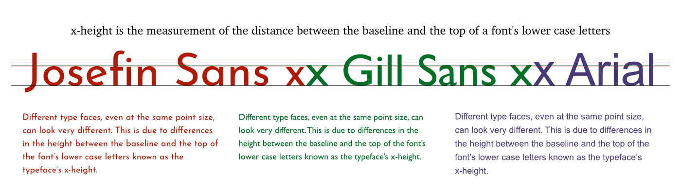
For printed documents, setting your body text at 9 to 11 points is a good place to start. Unless there is a good design reason, larger than that can make your document look clumsy. From there you can develop your hierarchy for other elements. Even with that rule to guide you, be aware that different typefaces, even at the same point size, can look very different. This is due to differences in the height between the baseline and the top of the font’s lower case letters known as the typeface’s x-height.
We have less control for websites since font size can be adjusted by the viewer’s browser, but 12 to 16 pixels is a good starting point.
Nobody Likes Long Lines
Legibility is also affected by line length or the width of your block of text. You want it just right, too wide or too narrow and the text will be more difficult to read. Blocks of text that are set too narrow cause the reader’s eye to constantly jump from one line to the next and this can get very distracting. On blocks that are too wide, it can be difficult for the reader to follow, especially when moving from line to line. They may lose their place—again disrupting the flow and making your message more difficult to read.
So what is the ideal text body width? About 52 to 78 characters wide will provide maximum legibility. When working on your layout count the number of letters and spaces to determine the line’s length.
You also need to take into consideration the style of your typeface, fancier serif typefaces may need narrower columns, closer to 52 characters wide or less. Justified body text calls for wider columns, closer to 78 characters wide, to look their best.
Pro Tip: It’s easier for you and improves legibility for the reader if you align body text flush left. While justified text lends itself to certain design styles it introduces problems caused by the additional space needed to make the right-hand side of the column align. So do yourself a favor and keep things simple by using a flush left alignment.
I’ve mentioned flow, or pacing, a few times. The flow of your document has a big influence on its legibility. There are several layout issues which can disrupt the flow, and they all have solutions. Let’s look at a few.
Bad Breaks
A bad paragraph break occurs when a paragraph breaks across pages in a way that disrupts the reader’s flow. In multiline paragraphs, you want to keep at least two lines of the paragraph together on a page.
Another bad break occurs if you have a subhead end a page. Aim for at least two lines of the paragraph to stay with its subhead.
These types of breaks can be corrected by editing the copy (if that is an option), adjusting the paragraph width, or adjusting the spacing between paragraphs or headings and paragraphs. A small change is usually all that is need to correct a bad break.
Avoid line-breaking hyphens. When an entire word won’t fit on a line of text most software will automatically add hyphens. These can become distracting and you should avoid them when possible.
Pro Tip: Use your software’s built-in hyphenation. Most software allows you to turn off hyphenation, to set a limit on the number of consecutive hyphens in a paragraph, or set the number of letters to appear before and after a hyphen. Learn where these settings are and use them.
If you must use a line-breaking hyphen be sure to use them correctly. Never hyphenate a proper name, title or subhead. Avoid more than two consecutive hyphens in one paragraph. And don’t hyphenate URLs or email address.
Poor Paragraph Styles
Paragraphs break long-form content into blocks that are easier to read and they make documents visually appealing. It’s important to give your reader a visual clue to where paragraphs begin and end. But don’t overdo it.
Paragraphs are indicated by either indenting the first line or adding vertical space between paragraphs. Choose one of these methods, but don’t use both. Doing so creates too much white space and disrupts the flow of the document.
Take full advantage of your software to establish indents or line spacing for paragraphs.
If you choose to indent the first line of your paragraphs don’t use the space bar to create the indent. Your software likely has a “First Line Indent” setting. Set it to 1-2 times as wide as your type size. (For 11 point text that means your first line indent should be from 11 to 22 points.)
If you are using vertical space instead of indents to indicate a new paragraph, don’t hit the return key multiple times to create that space. Use the software’s “Space Before” or “Space After” setting. Most software has a setting for both before and after. You only need to use one. The ideal vertical space to indicate a new paragraph is about 50-80% of the type size. (For 10 point text the space should be five to eight additional points.
Mix Things Up
You want your document to be read. That’s why it was written in the first place, right? It doesn’t matter how well written the document is if no one gives it a chance because it looks boring or overwhelming. Don’t create page after page of dull grey text. There are lots of ways to break up large blocks of text to make them easier to read and more effective.
- Drop Caps or Initial Caps
- Rules
- Pull Quotes
- White Space
- Graphics
Knowing when to stop is important. You don’t want to go overboard and drown your document with excessive embellishments.
Emphasizing text is another way to break up the page while calling attention to something on the page. But remember, if you emphasize too much you weaken all of your emphasis. There are many ways to emphasize text.
- Bold
- Italic
- Small Caps
- A Different Type Face
- Color
Whatever approach you take, choose one and use it throughout your document.
Pro Tip: Set acronyms and initialisms—abbreviations consisting of initial letters pronounced separately (e.g., CPU) in small caps to create a professional
looking document.
You will improve your documents professionalism when you use symbols and special characters correctly. While it is tempting to avoid special punctuation marks, trademark and copyright symbols, degree symbols and accented characters, they aren’t really that hard to use.
This is particularly important with diacritical or accent marks as they can change the meaning of a word. For instance in Spanish, “
Pay Attention To The Numbers
Be sure to use the appropriate figure style when working with numbers in OpenType typefaces. Not all typefaces include these. But if you’re lucky enough to have an OpenType font that has these figures use them in the right places. Here’s a cheat sheet:
- Oldstyle Proportional for body text
- Lining Proportional for uppercase text (not in body copy)
- Oldstyle Tabular for elegant table data
- Lining Tabular for basic tables
And a dash of professionalism:
— Use em dashes to connect thoughts (do not use two dashes)
– Use en dashes to show a range
– Clarify using hyphens
Designate feet and inches with prime symbols. A single prime symbol designates feet and a double prime symbol designates inches.
“Her painting’s height was 5′6″.”
(See the difference?)
Pro Tip: To create prime symbols on a Macintosh computer hold down option plus shift and type an E ′ and to create a double prime hold down option plus shift and type a G ″. On a Windows computer hold down alt and type the number 8242 to get a single prime or hold down alt and type 8243 to get a double prime.
Conclusion
The few guidelines I’ve laid out here will go a long way toward making your documents look more professional. Content will always be king, but if you want your content to be read and your message to be remembered pay attention to the typography of your documents. 

0 Comments